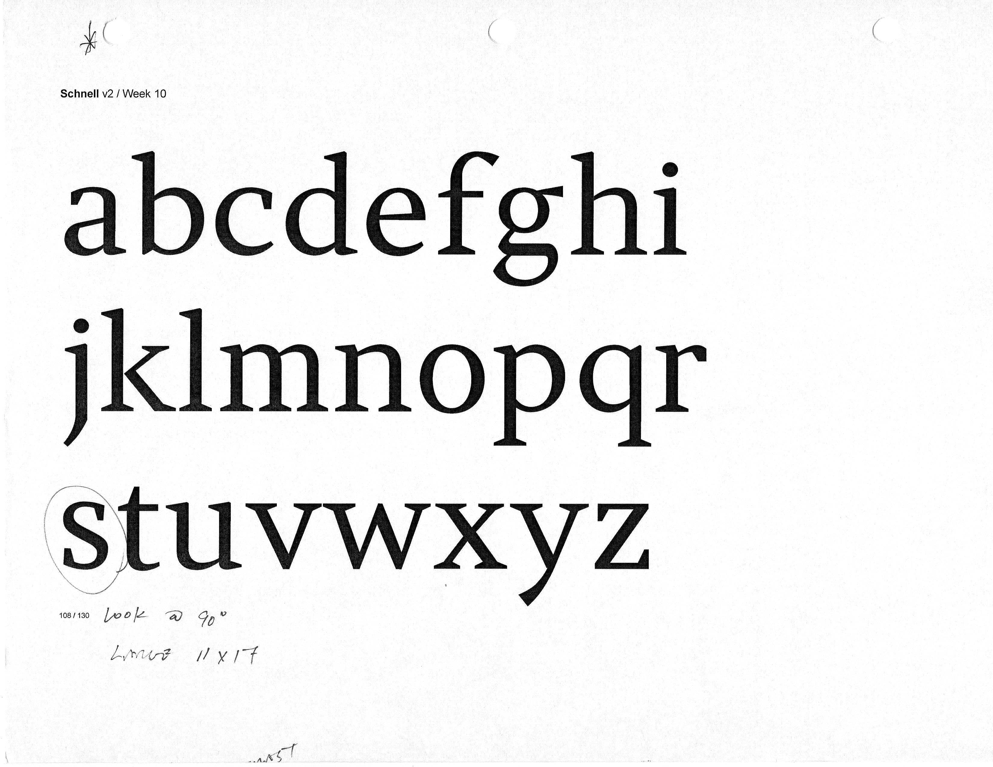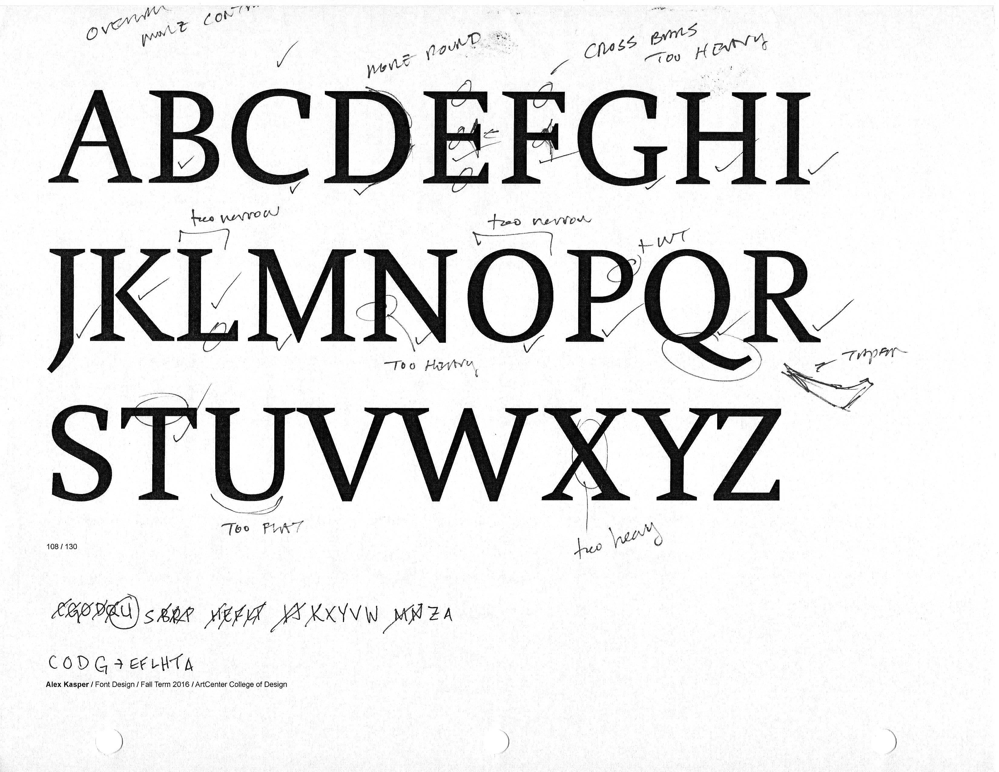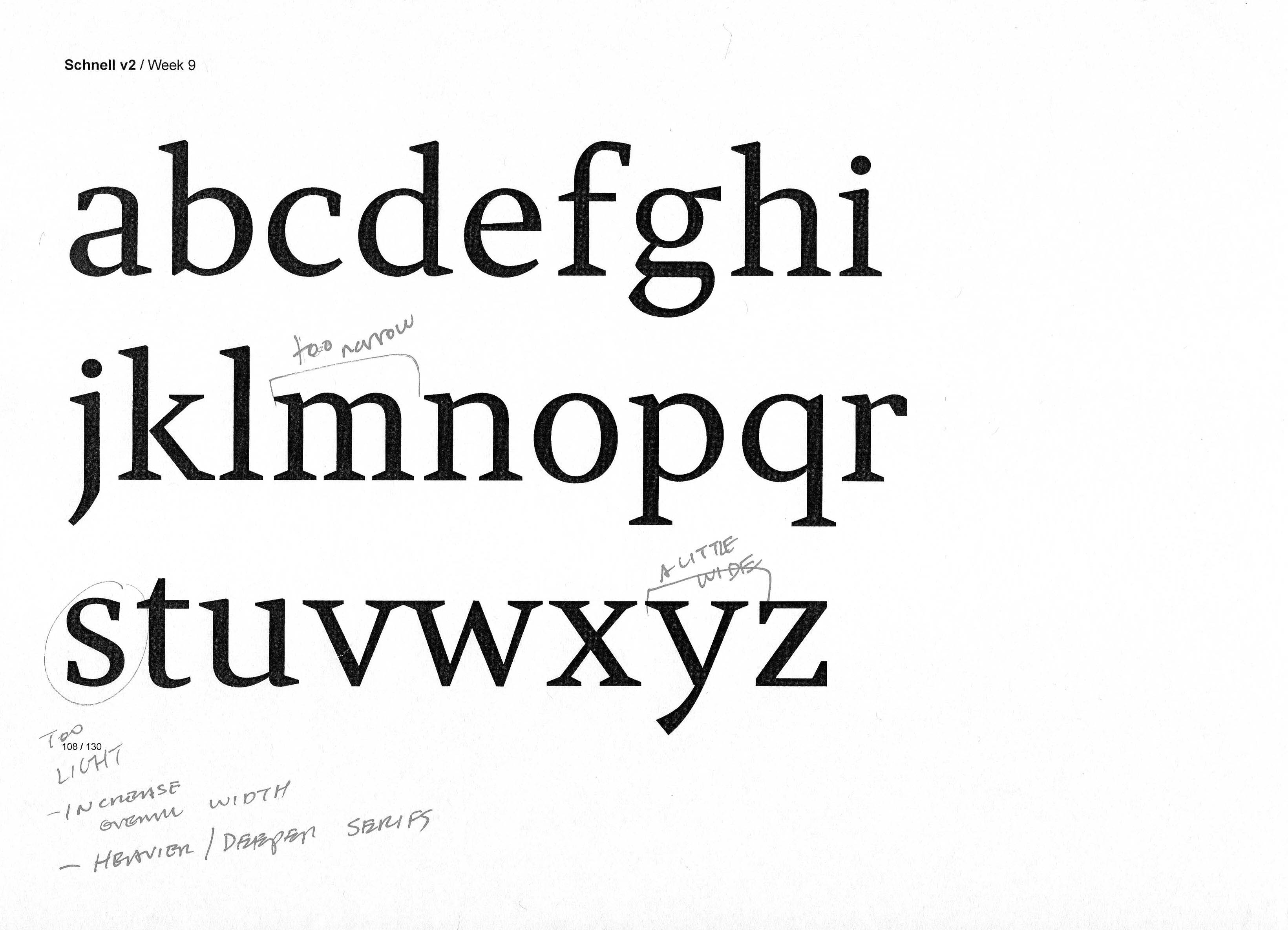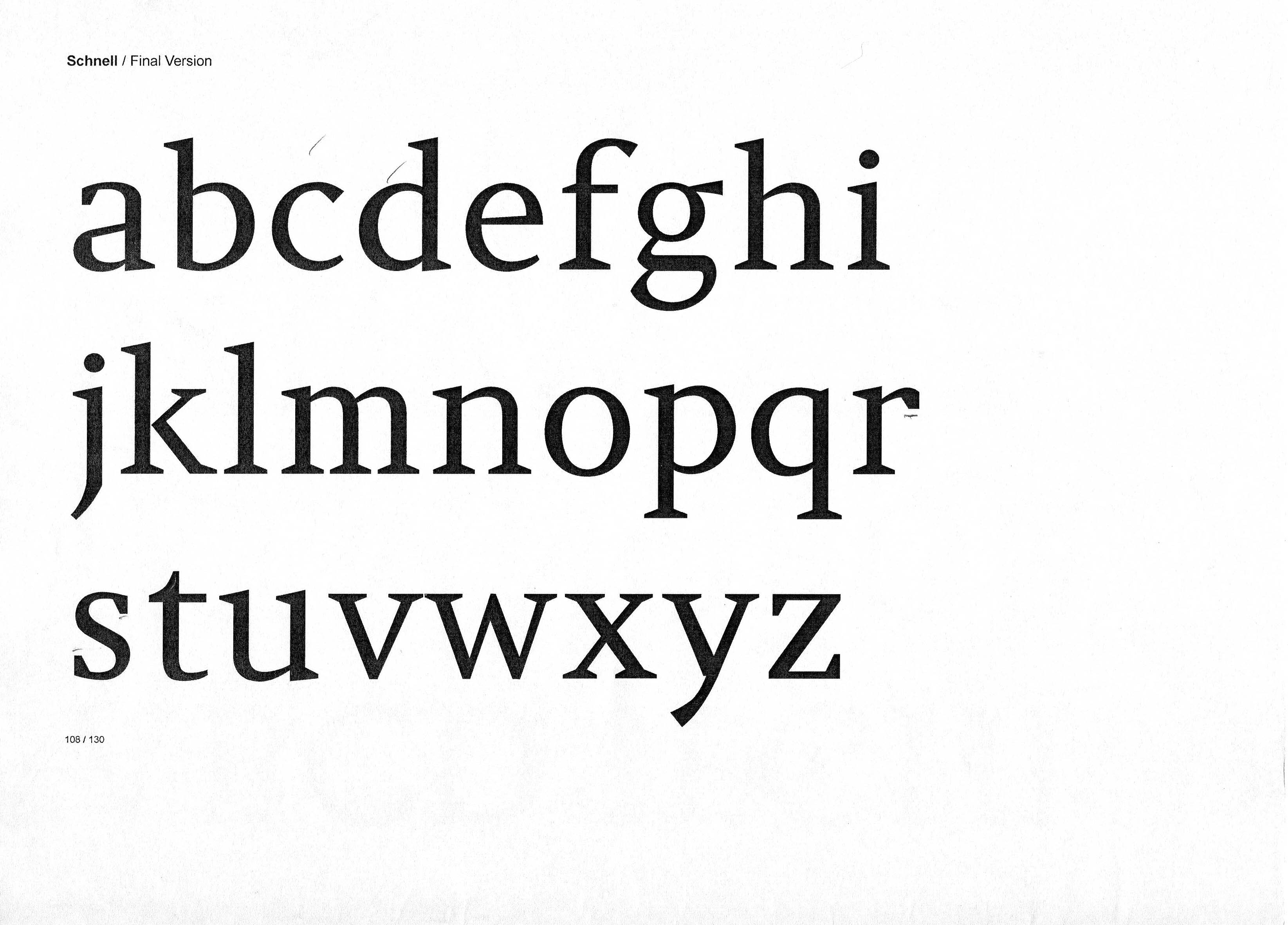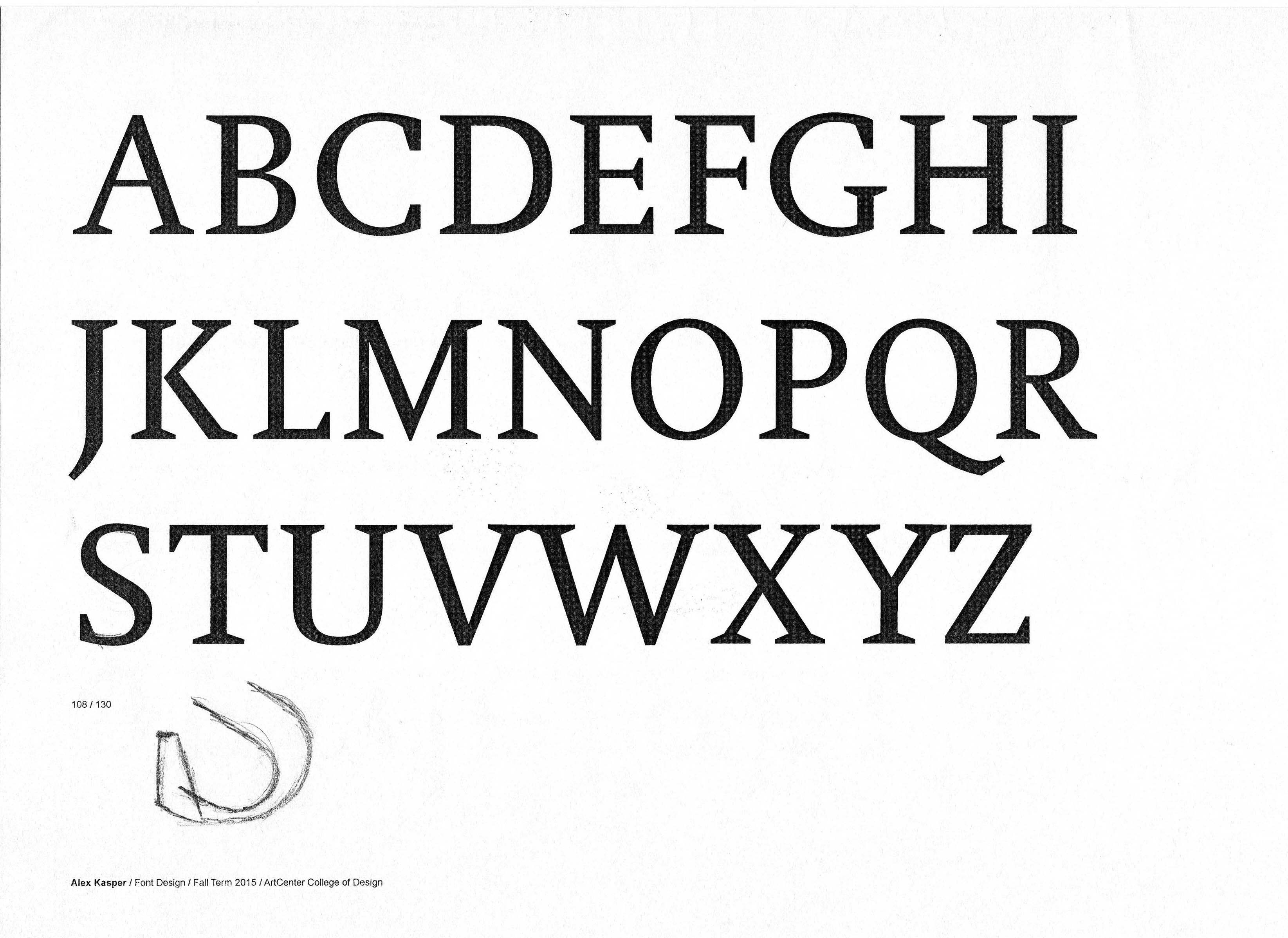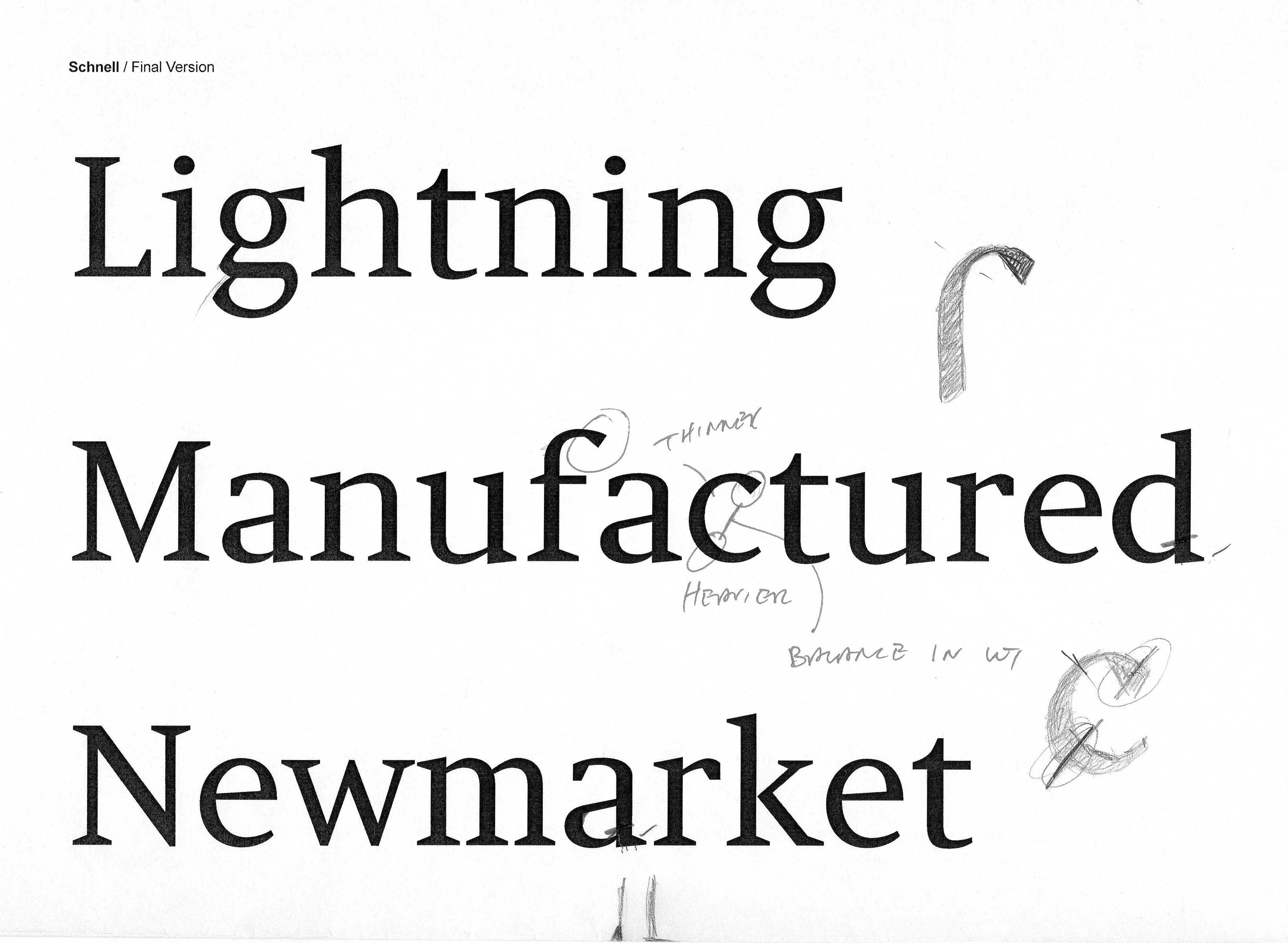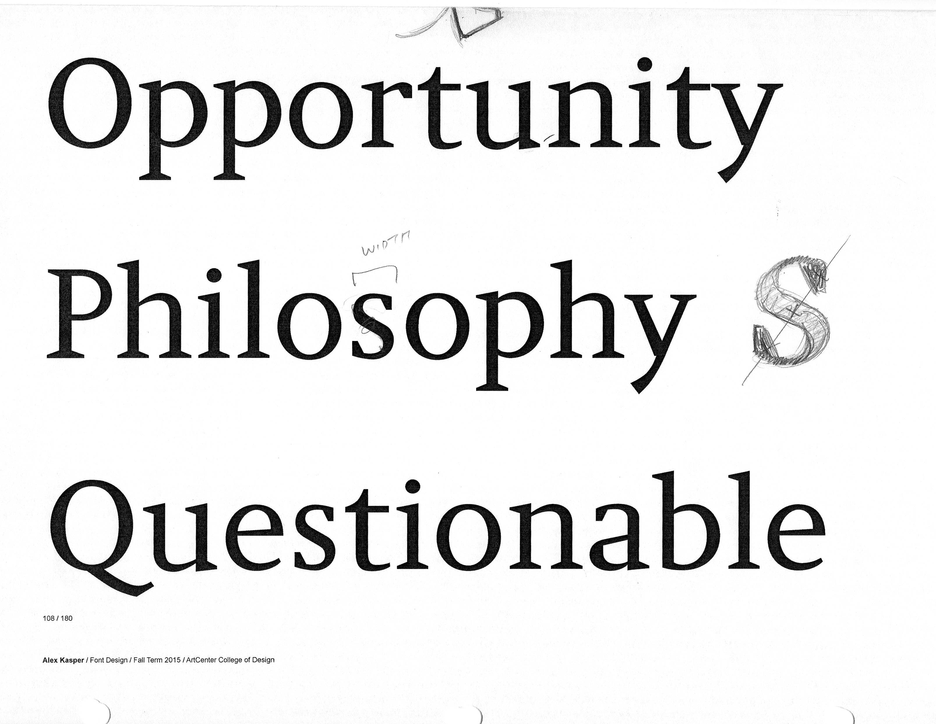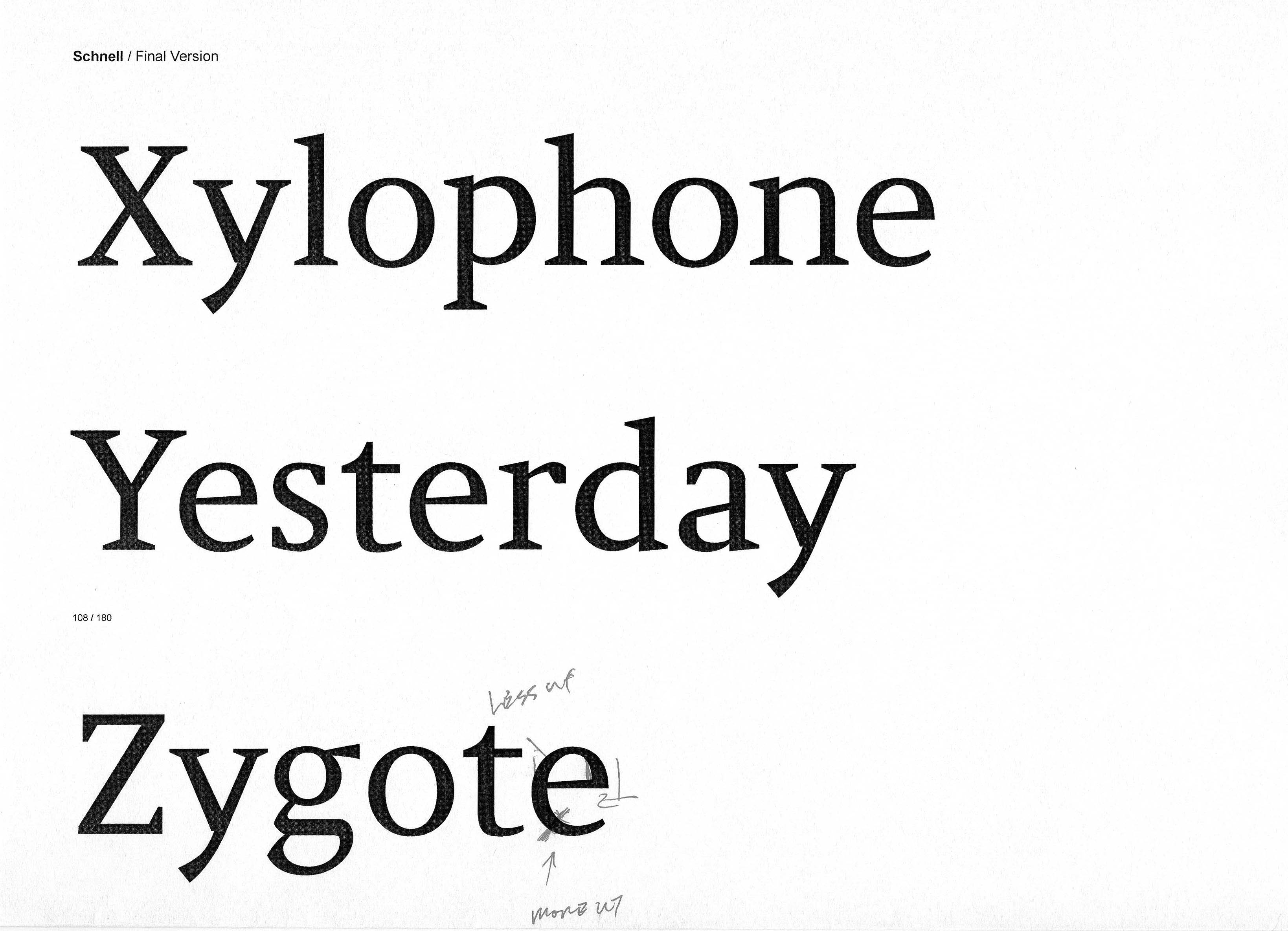


Schnell began as a font design project two years ago that I have continued to refine and expand. Inspired by contemporary serif typefaces like Gerard Unger's Swift and Martin Majoor's Scala Serif, I wanted to design a font that felt contemporary and elegant but neither overly feminine or masculine.
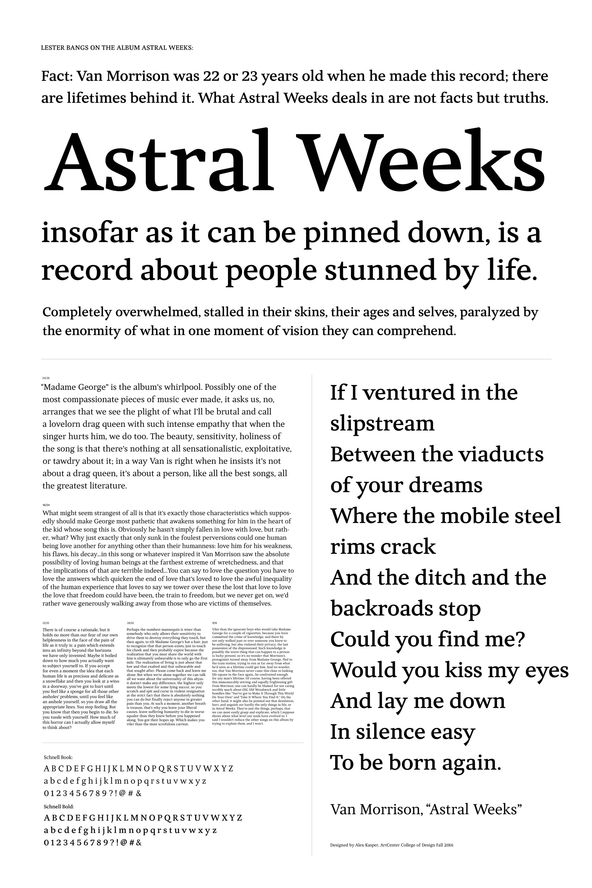
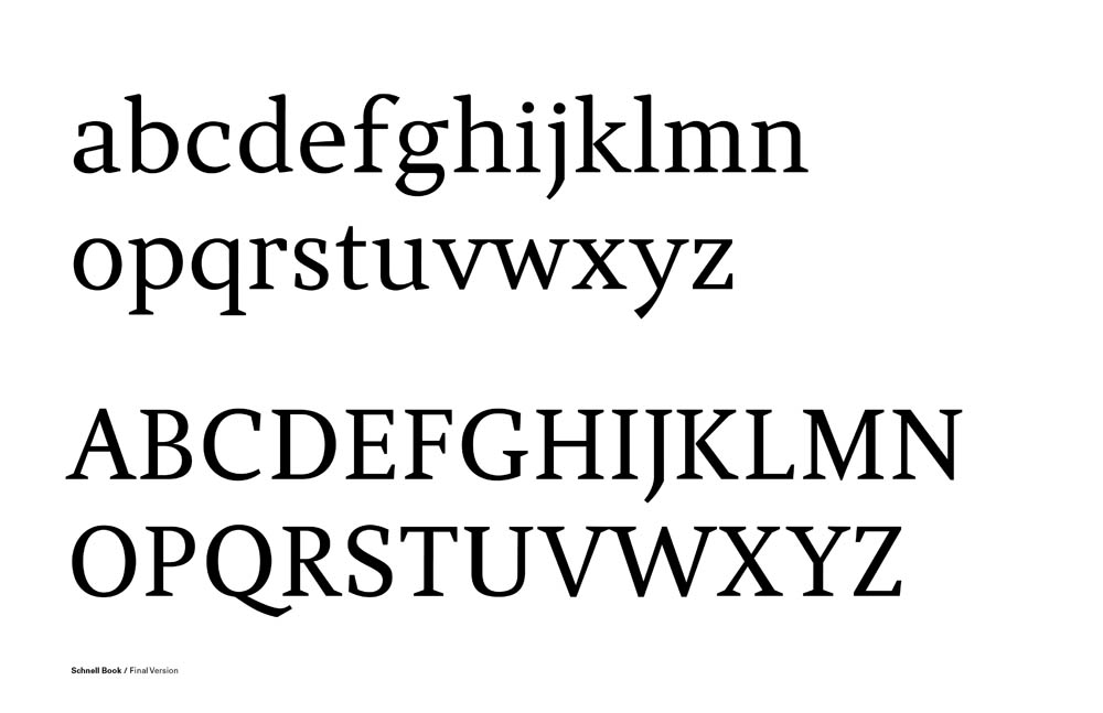
The initial design was still too reliant on its sources of inspiration and I wanted to find its unique voice. When I revisited the font in an independent study with font designer Greg Lindy, he advised designing the bold weight to try and find that unique character. From there I was able to establish a clearer voice for the regular weight as well. I intend on continuing the design with the italics in the future.
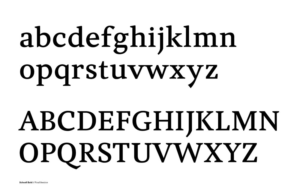
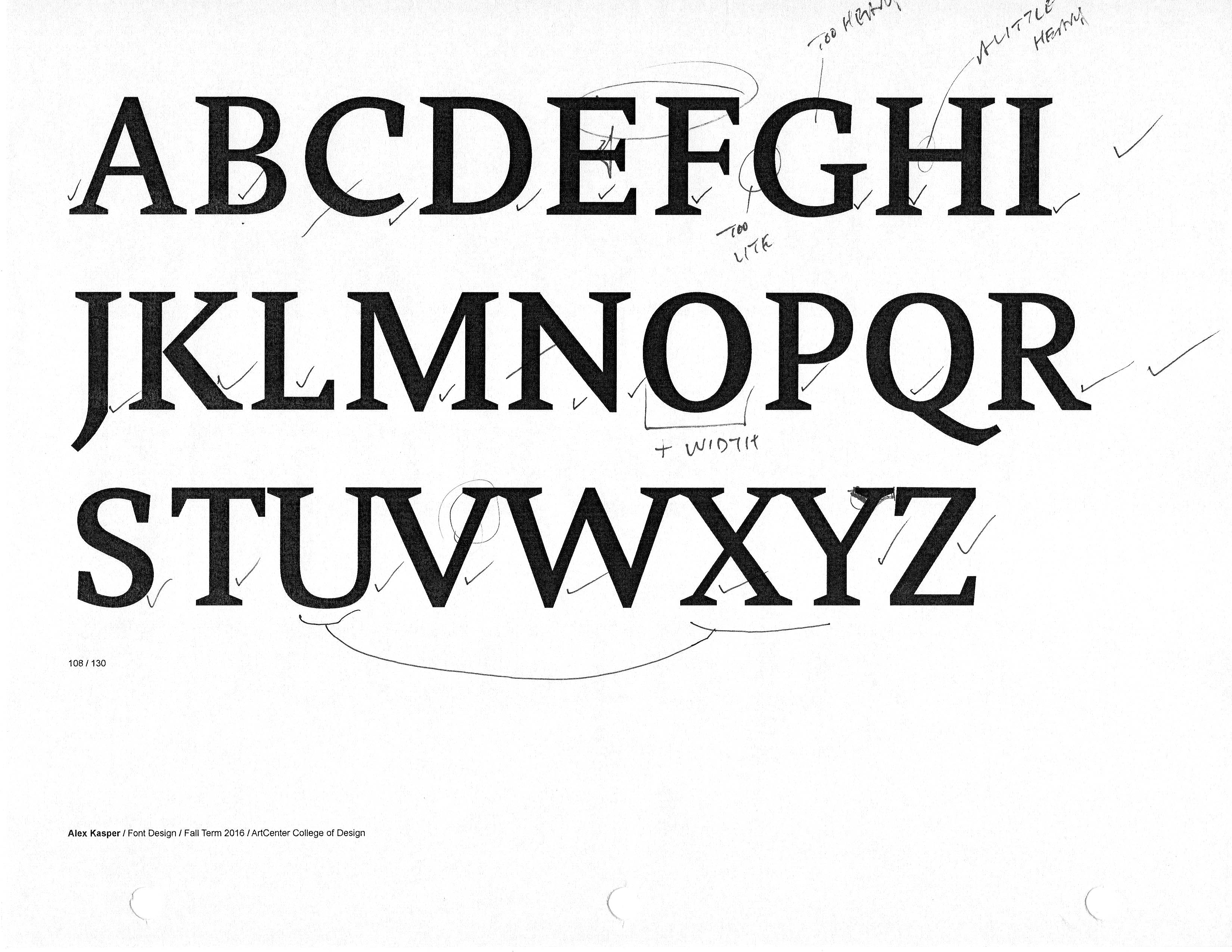
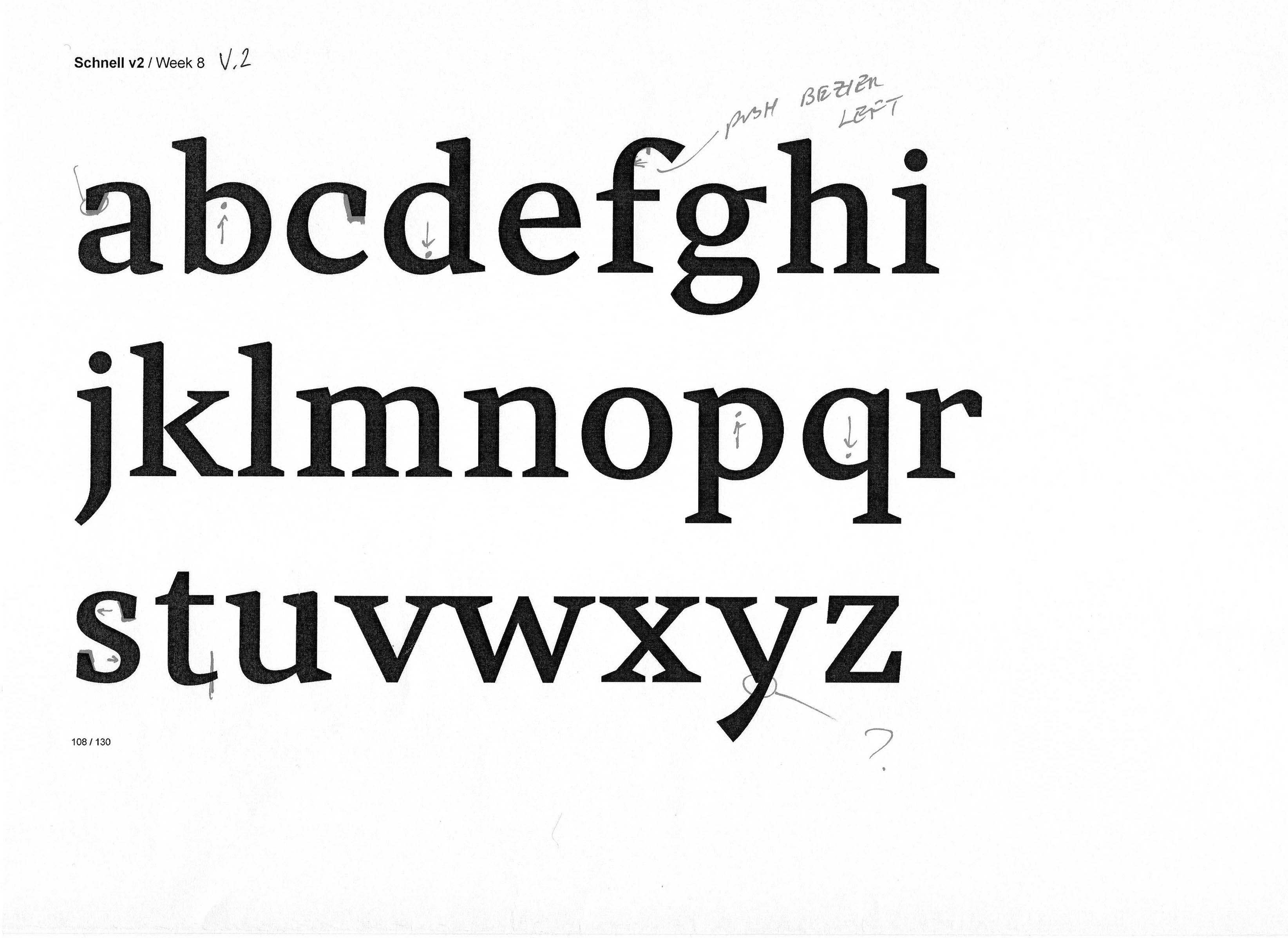
Development of the bold weight of Schnell.
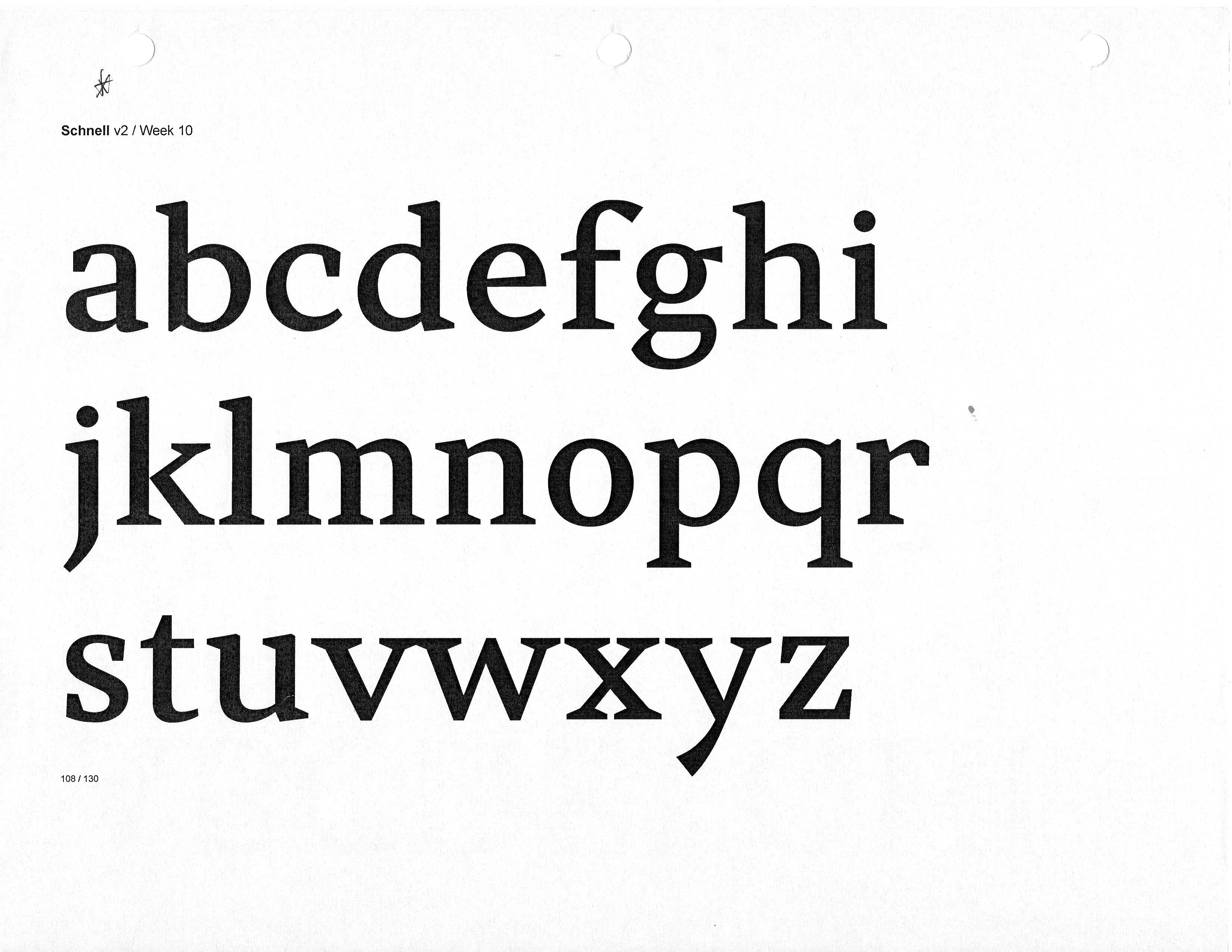
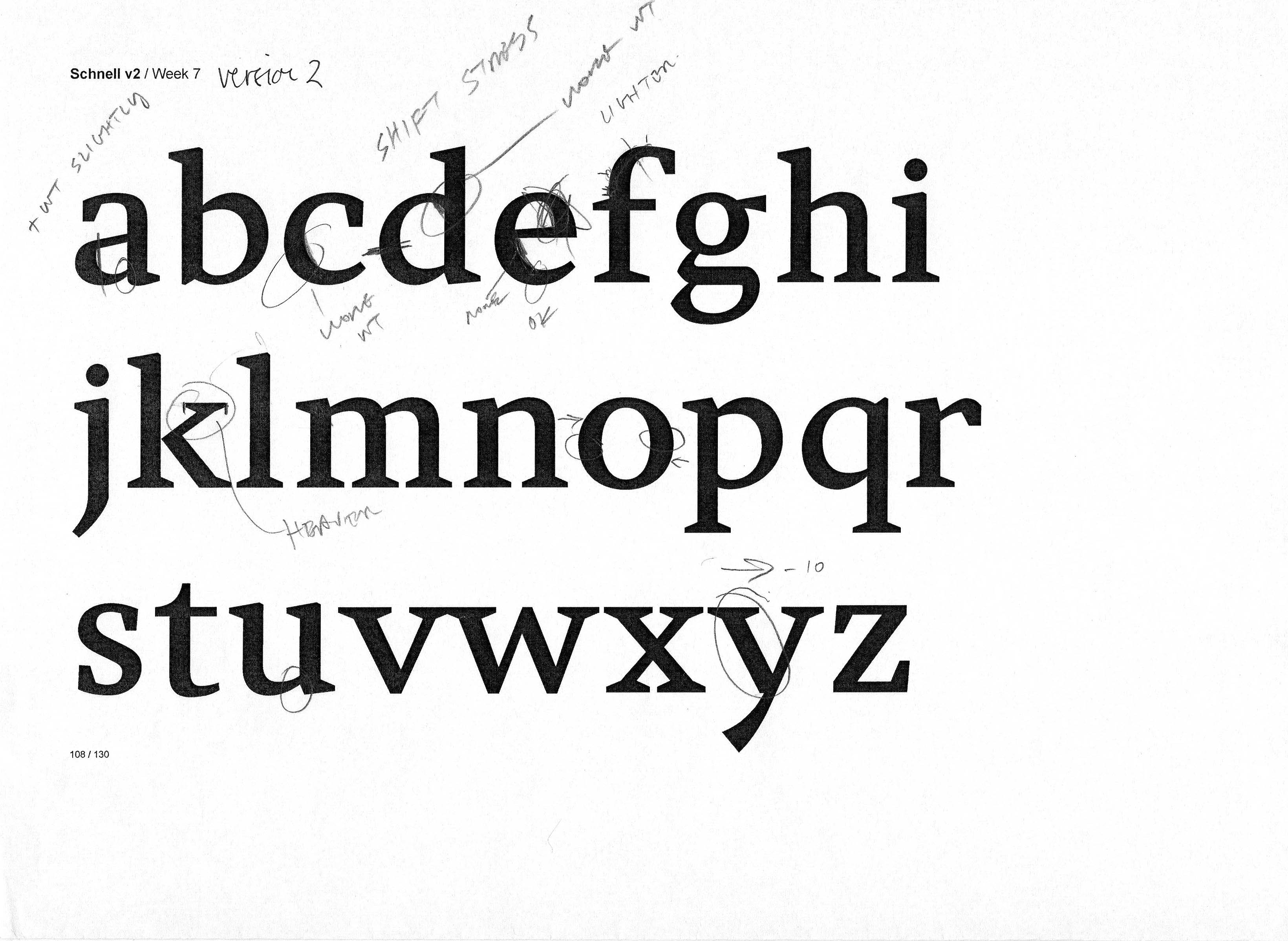
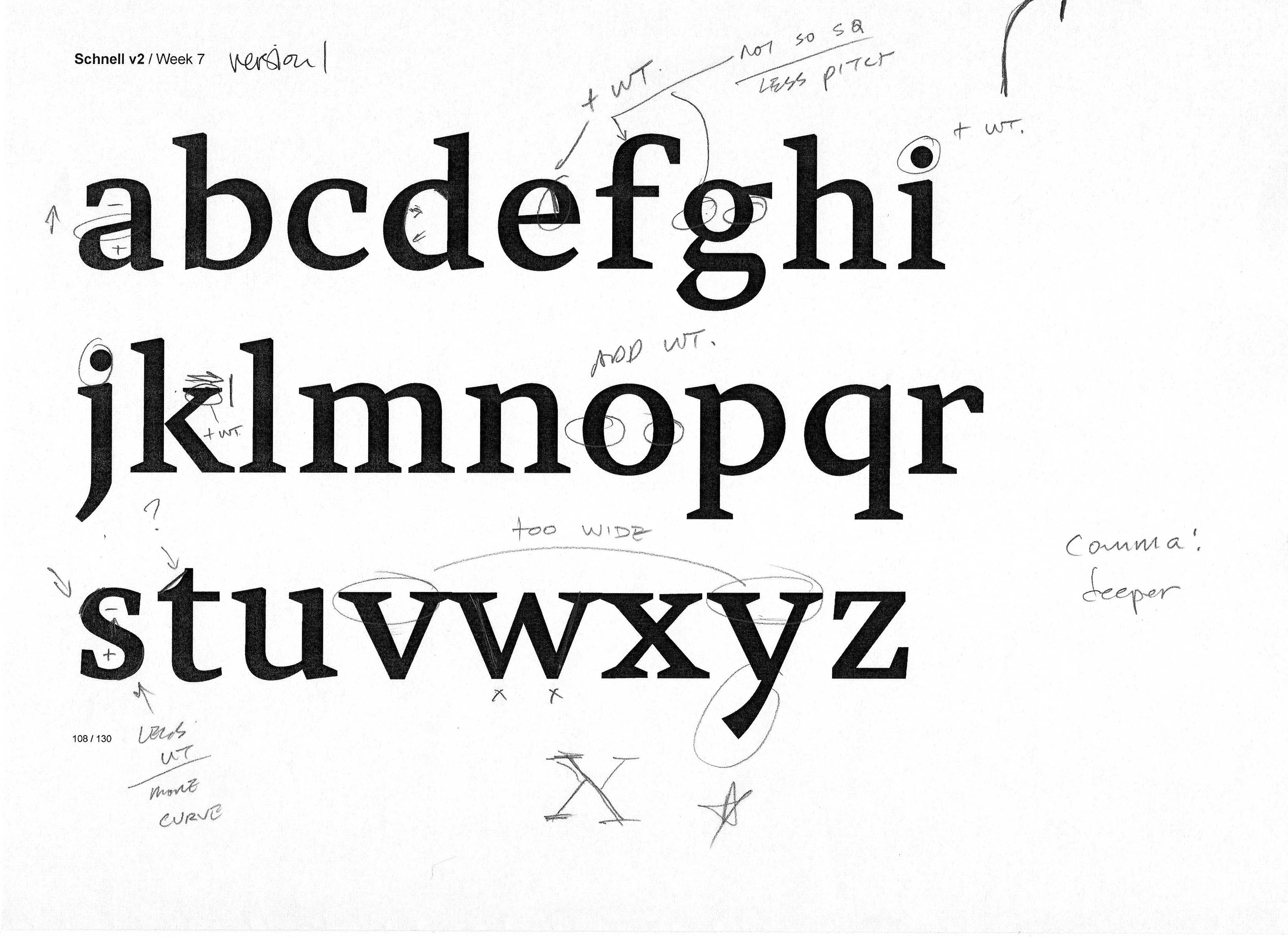
Development of the regular weight of Schnell, including the initial version finished a year ago.
