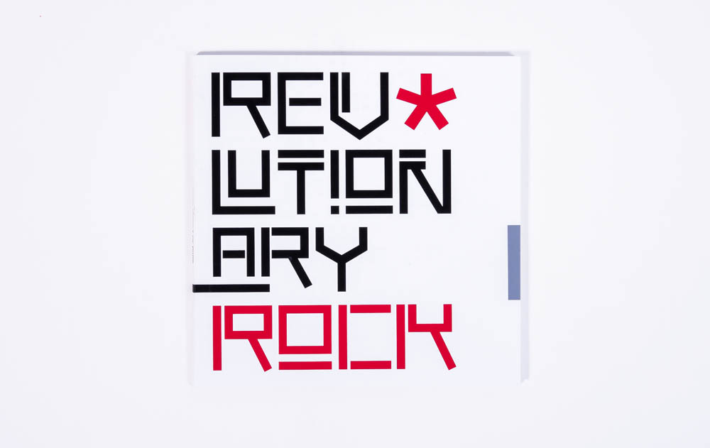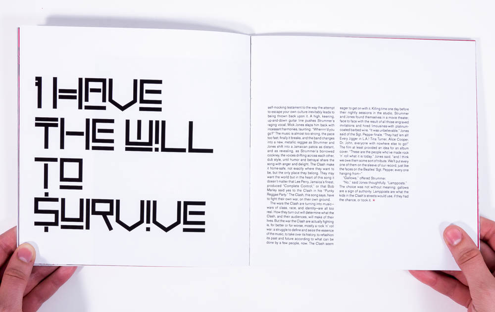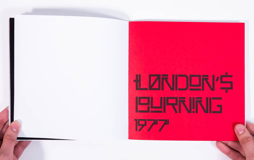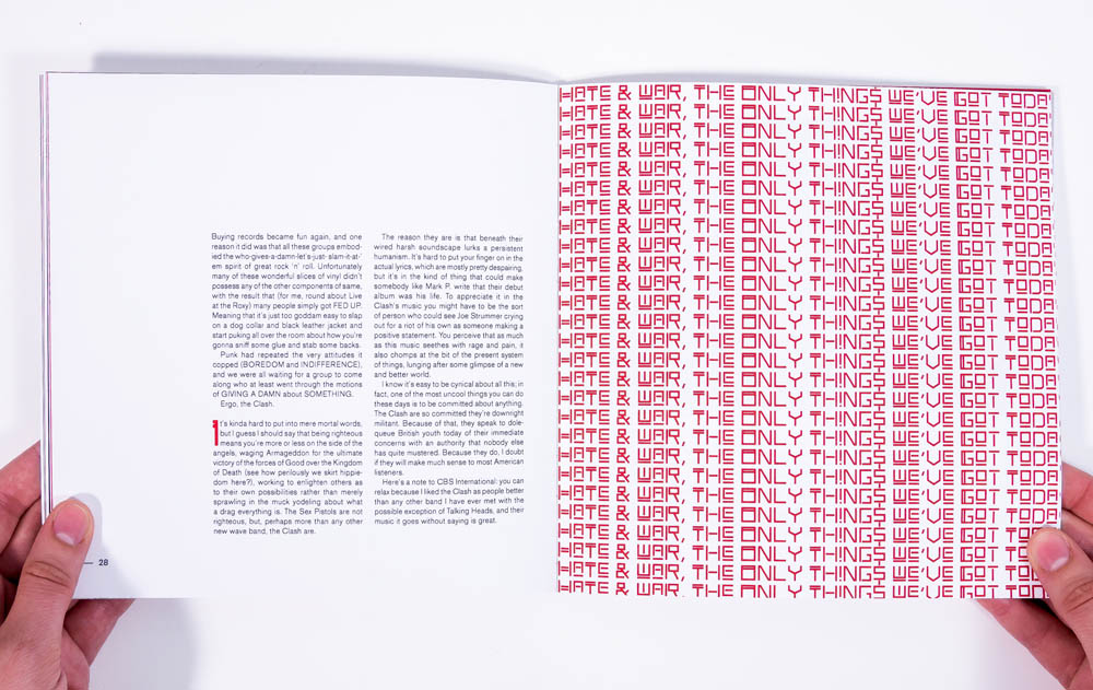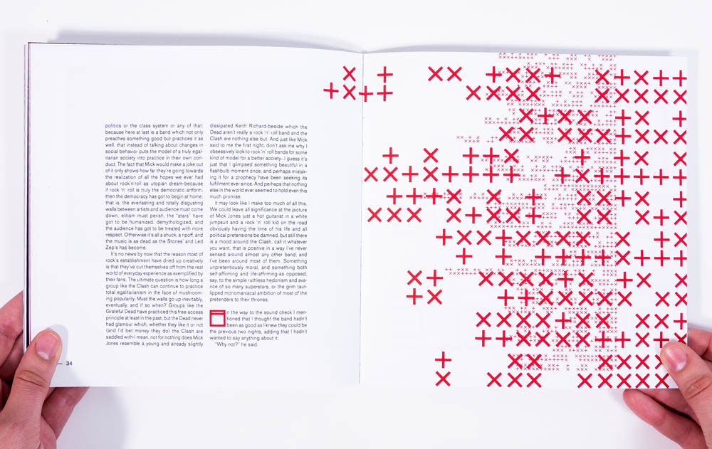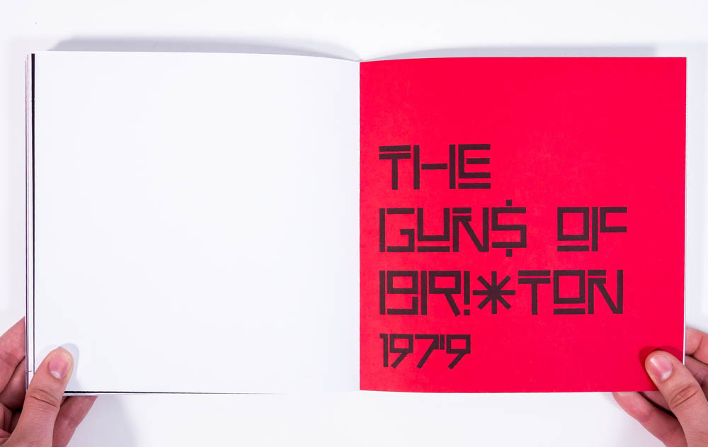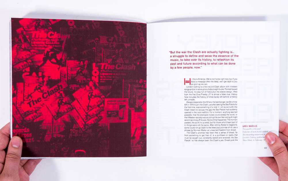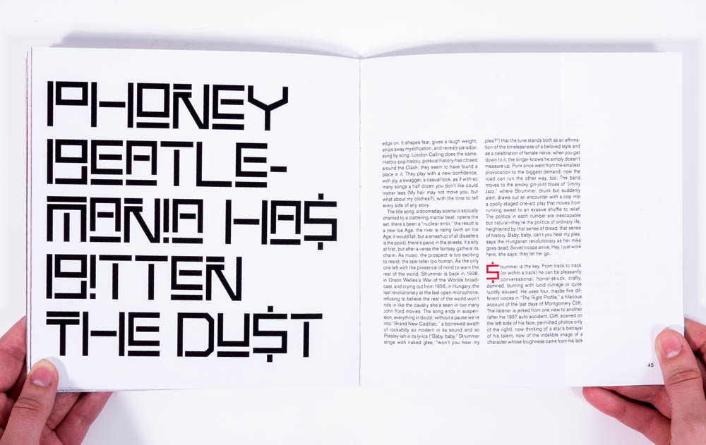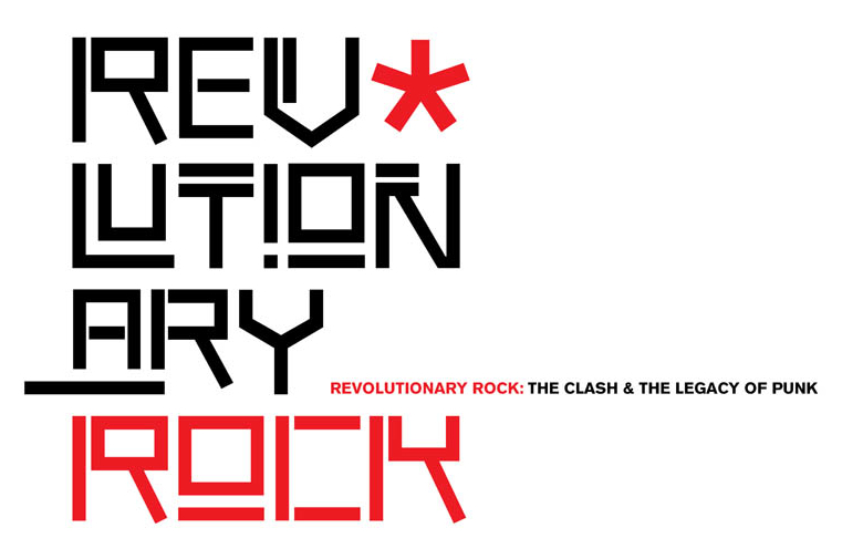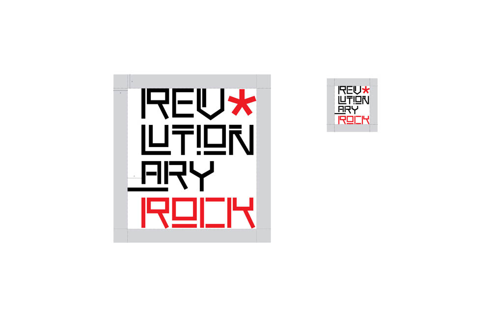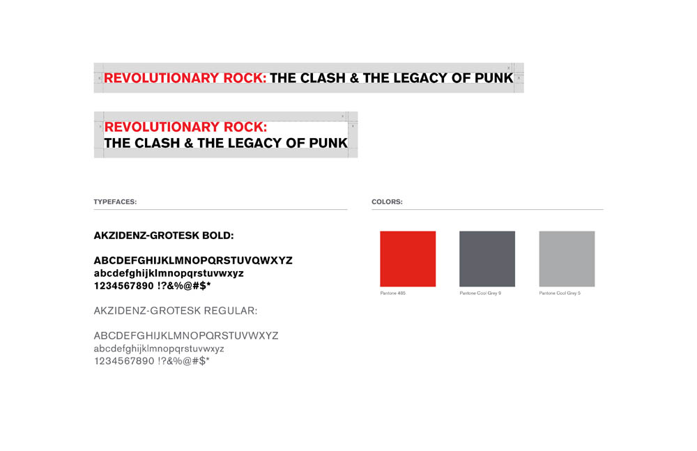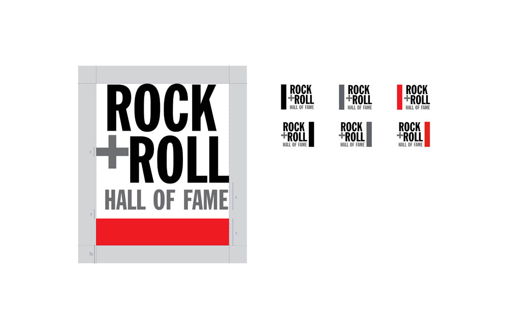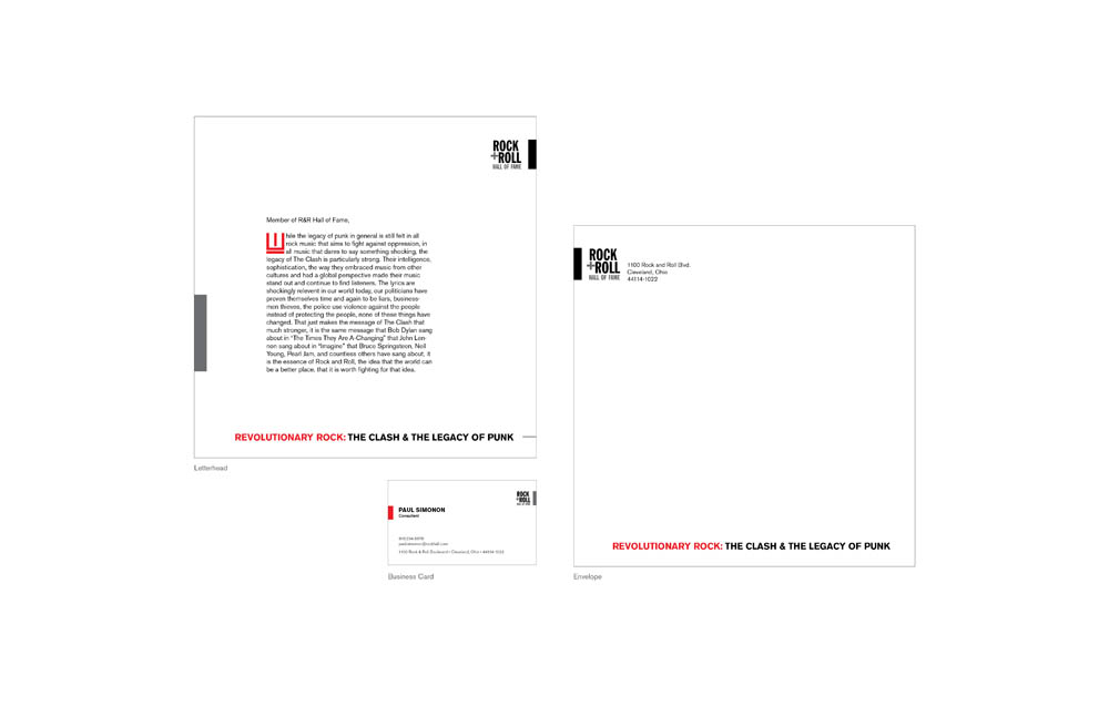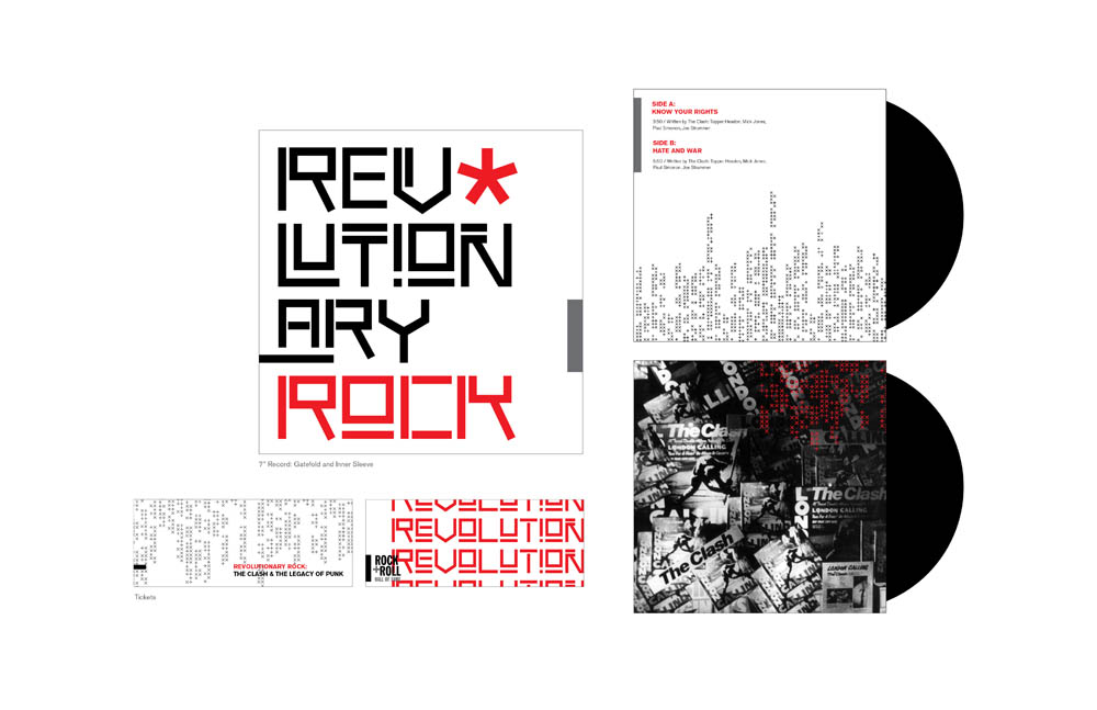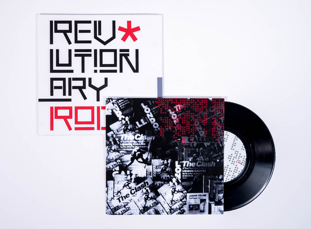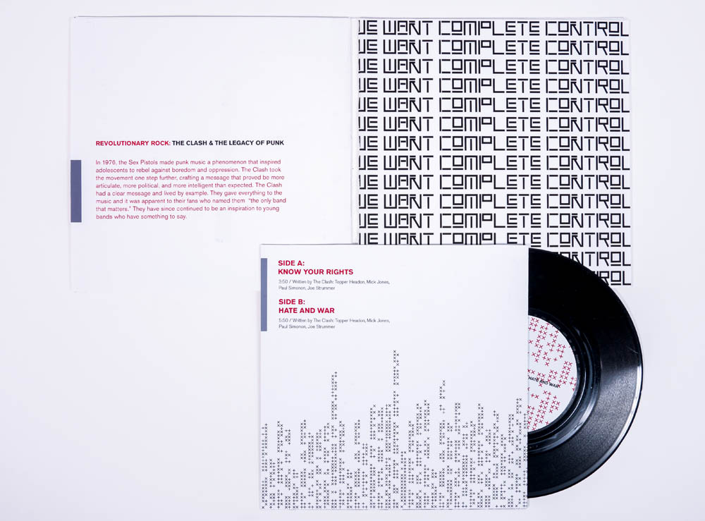


Branding and exhibition design for the Rock & Roll Hall of Fame Museum exhibit on the Clash and the revolutionary messages carried in punk music. The main challenge was to avoid the visual language most often associated with punk that was established by Jamie Reid’s work for the Sex Pistols and to find a visual voice that drew on the sound and message that was unique to the Clash.
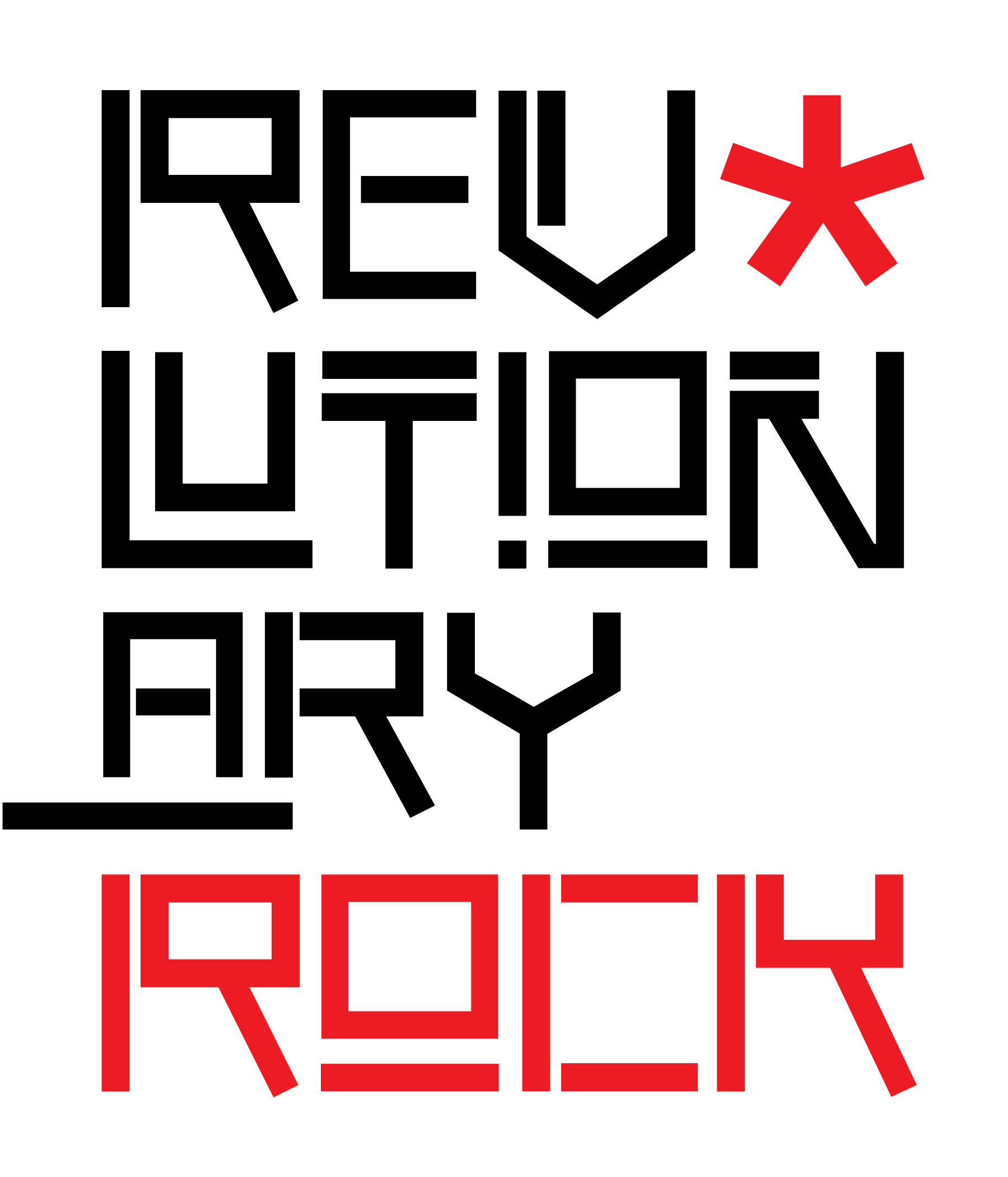
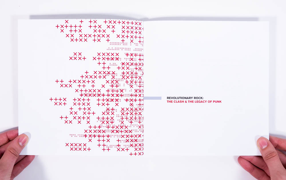
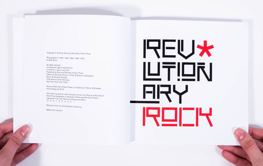
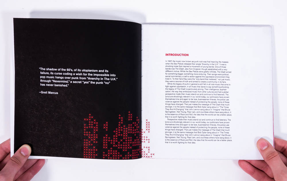
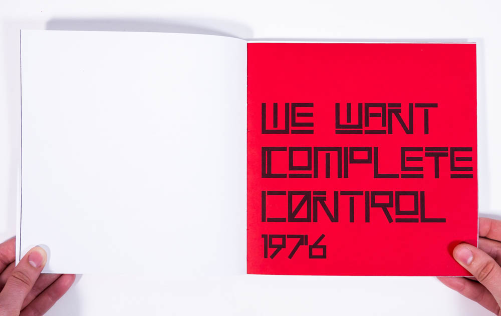
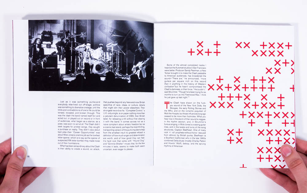
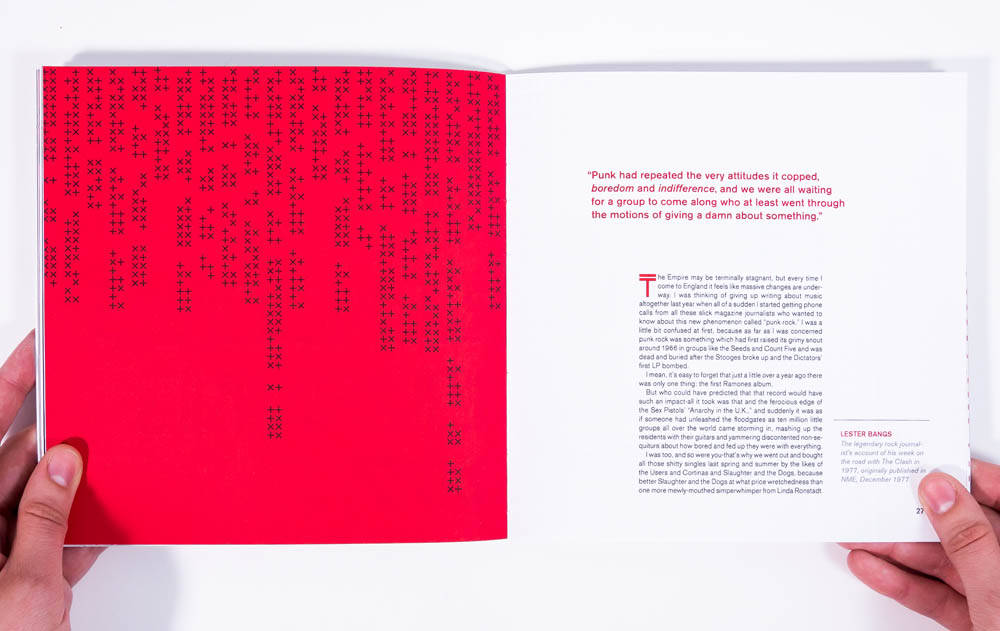
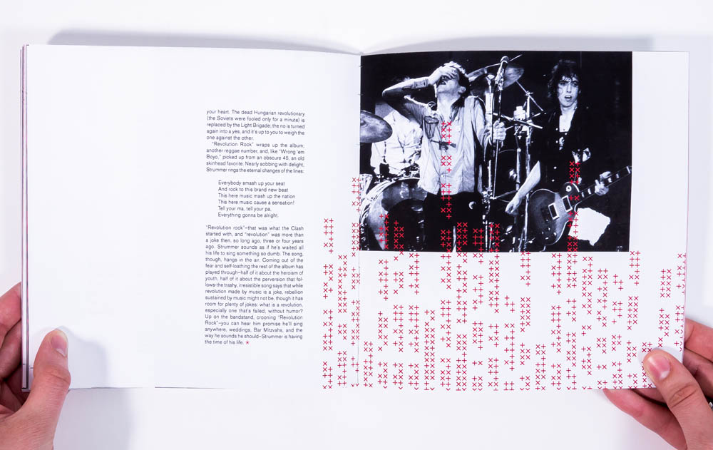
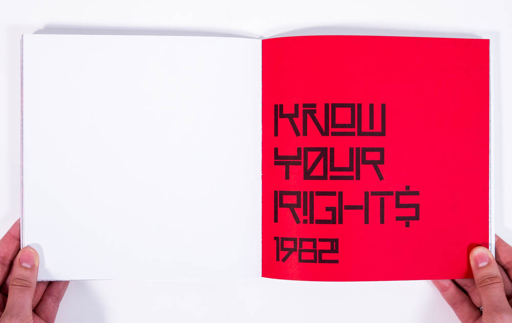
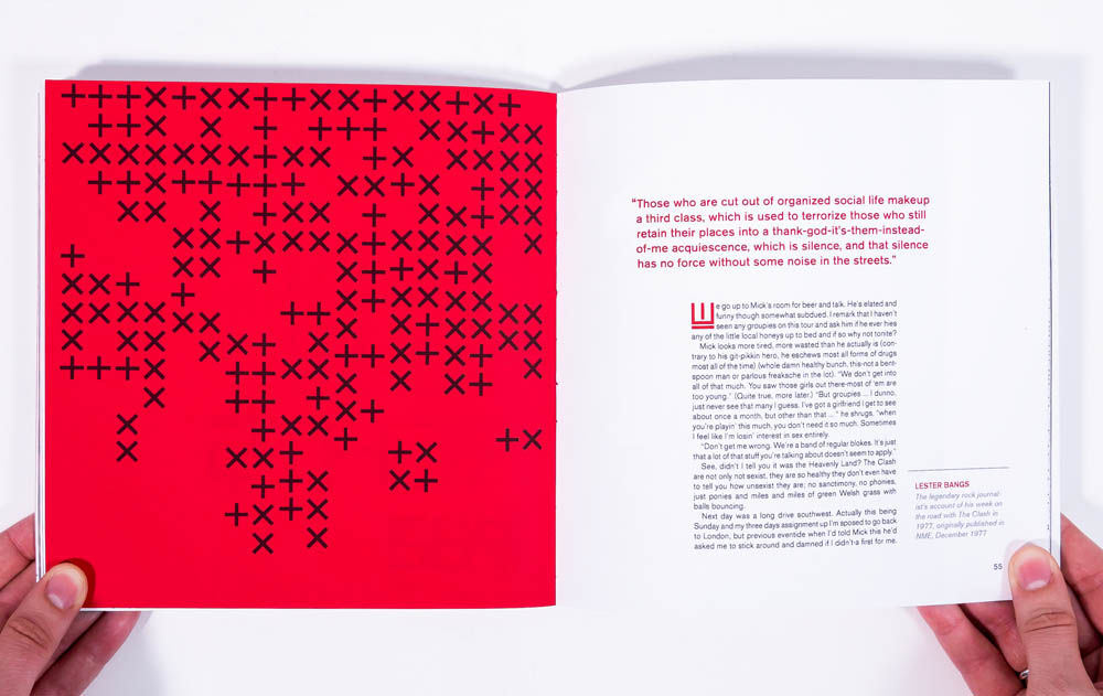
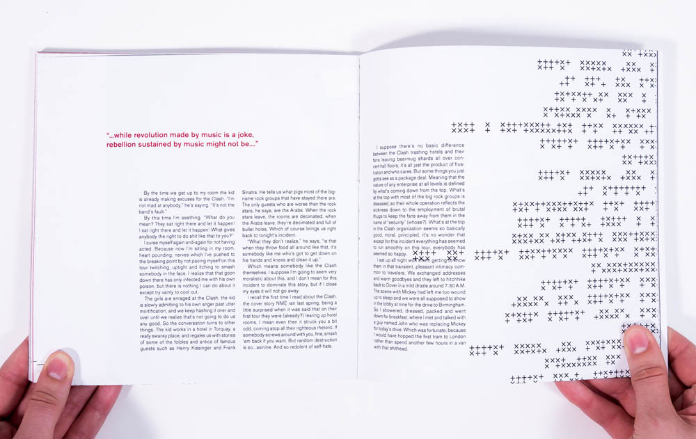
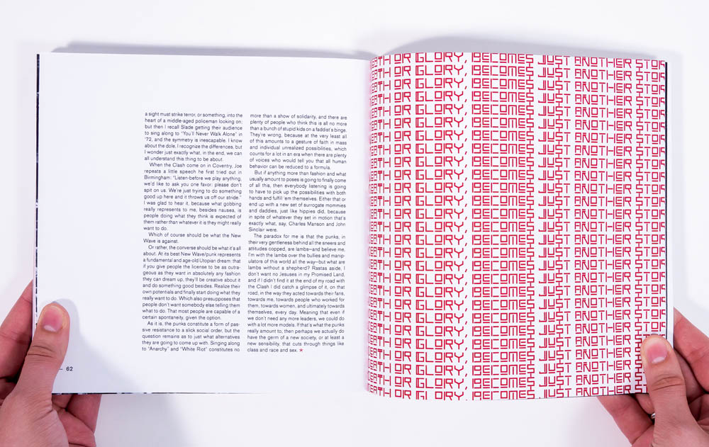
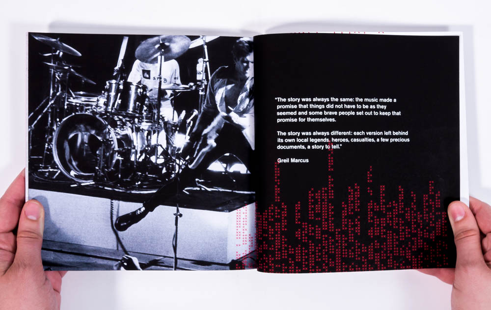
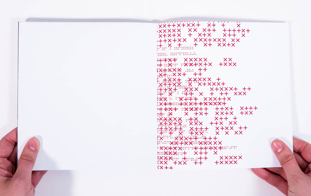
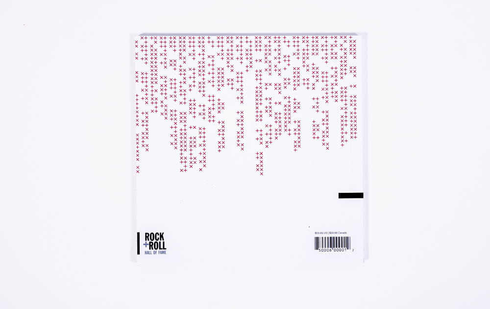
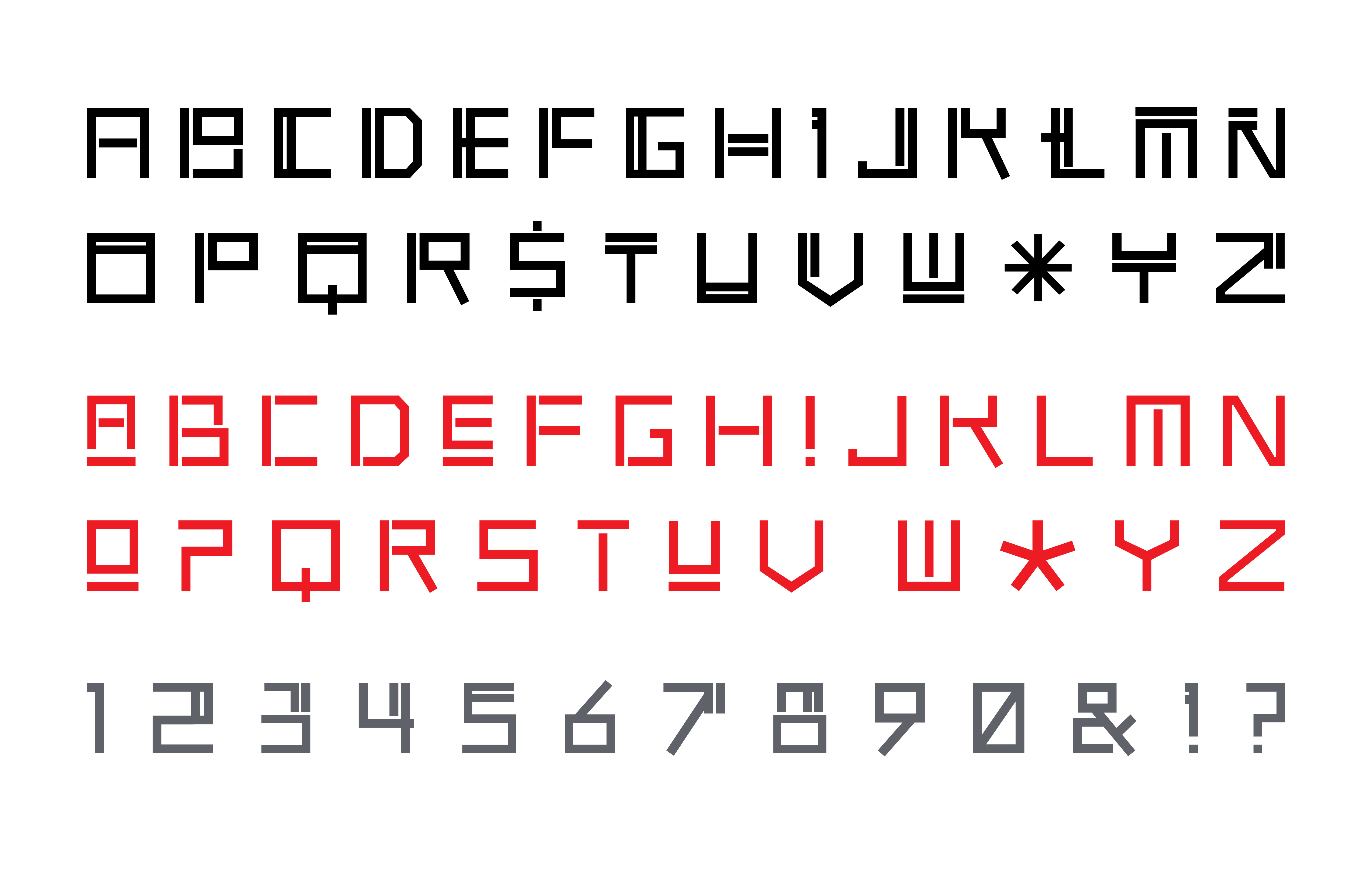
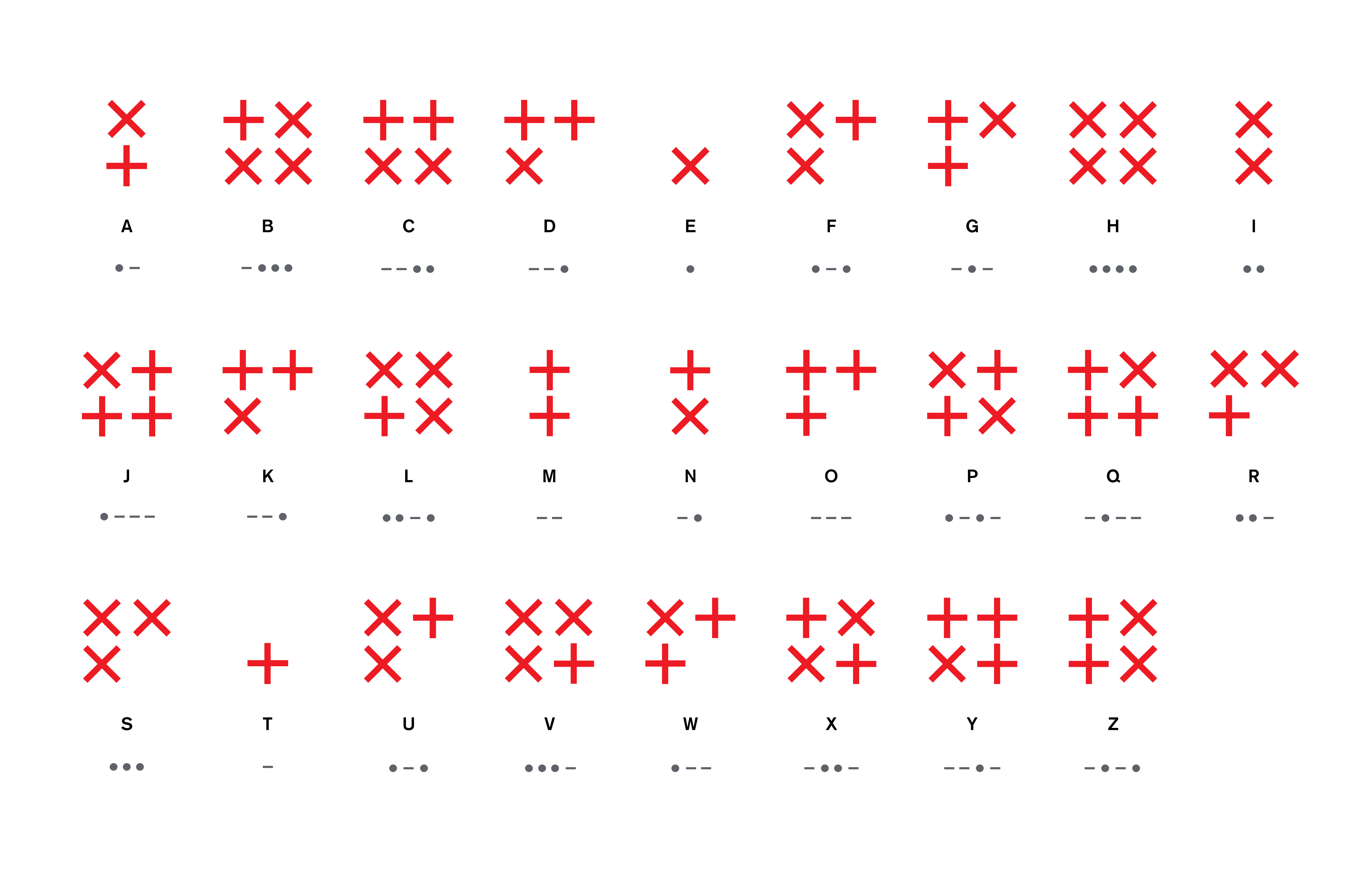
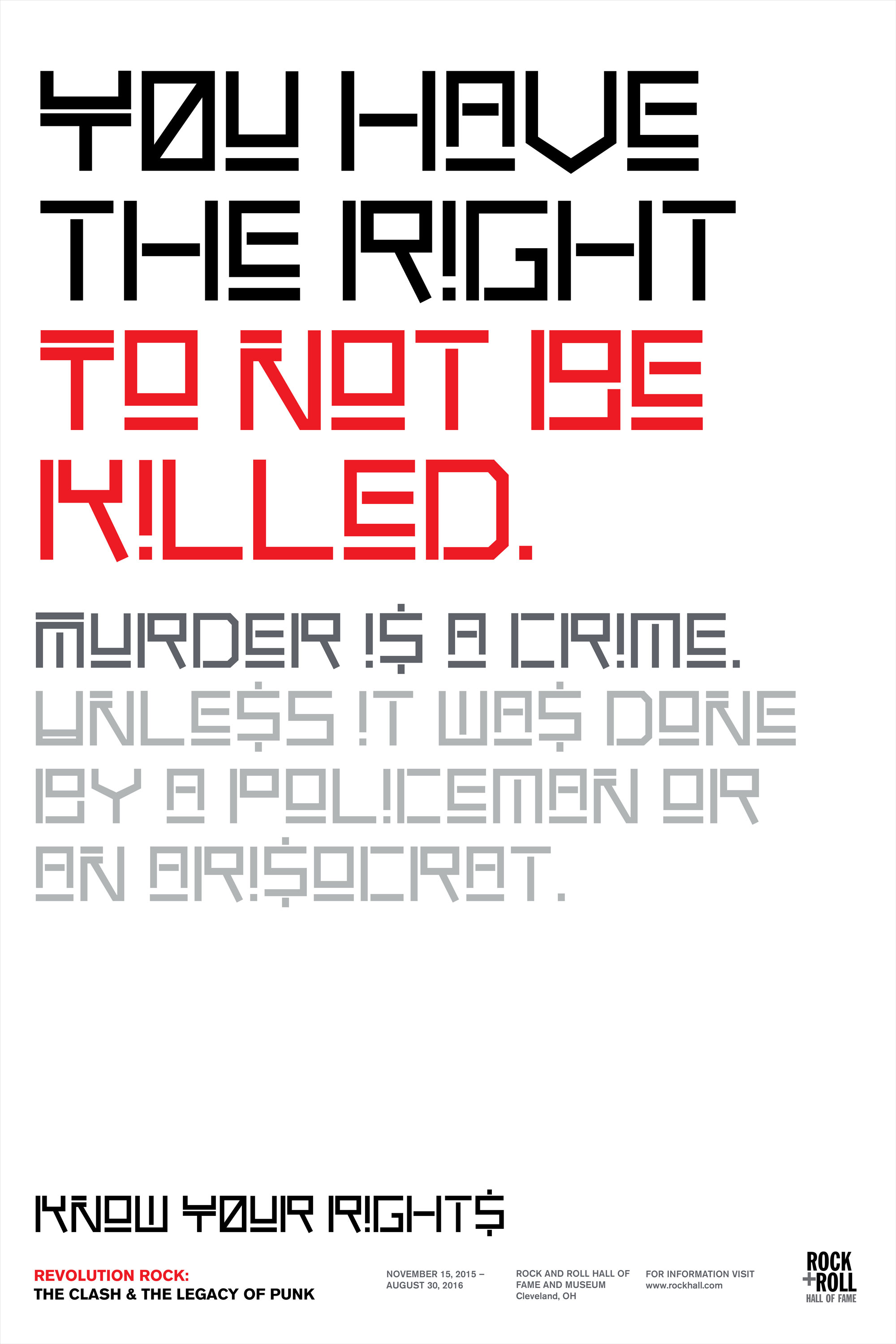
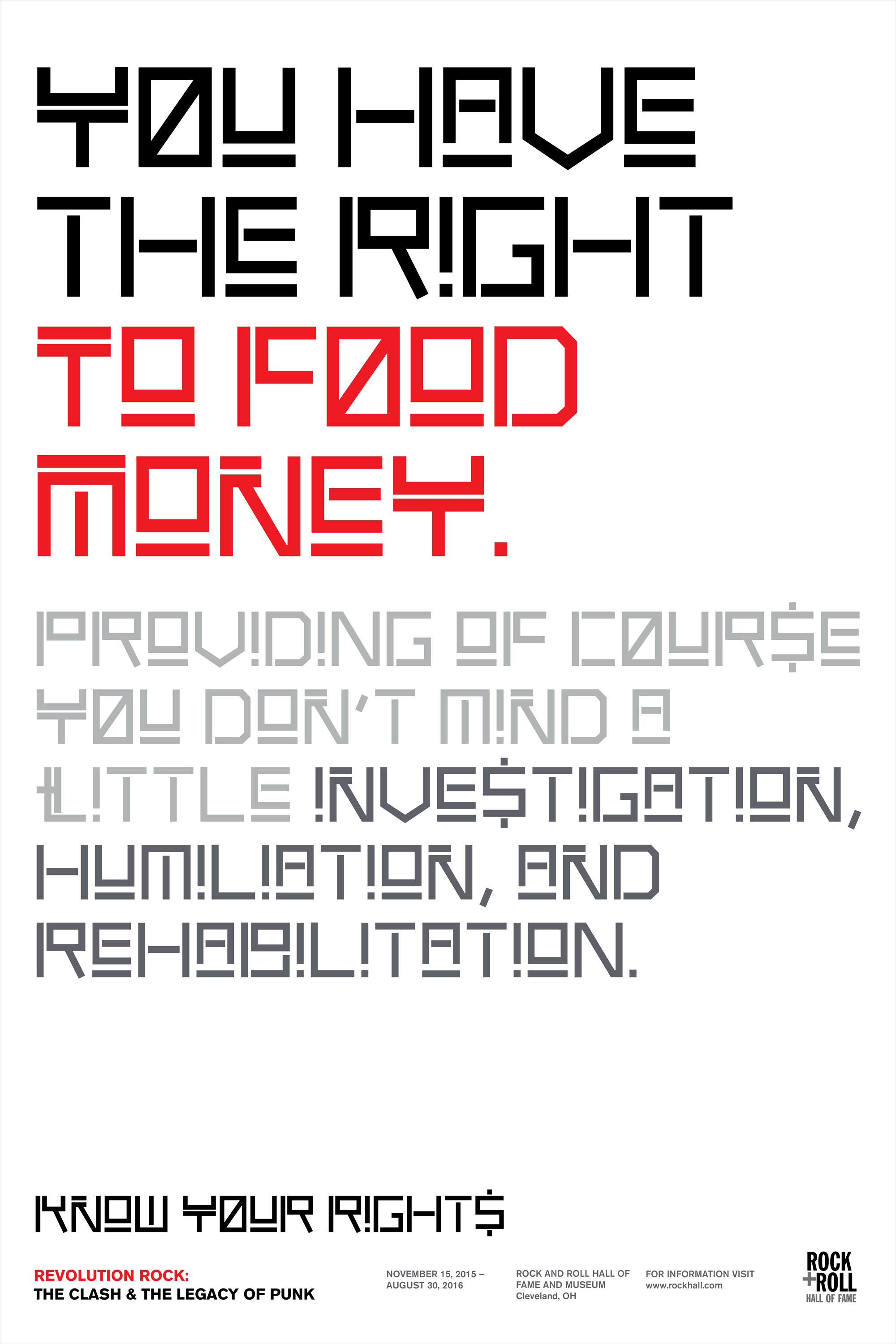
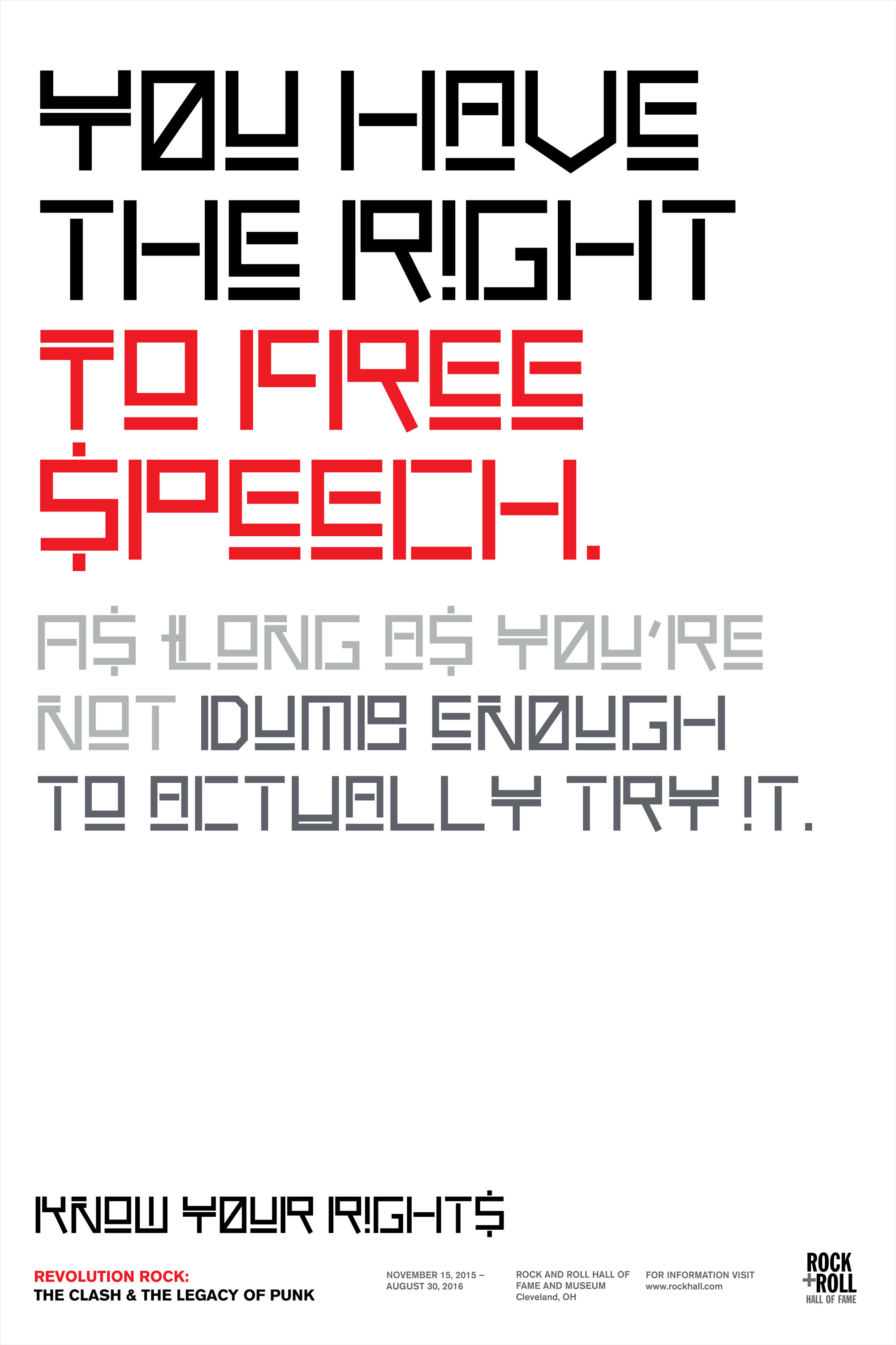
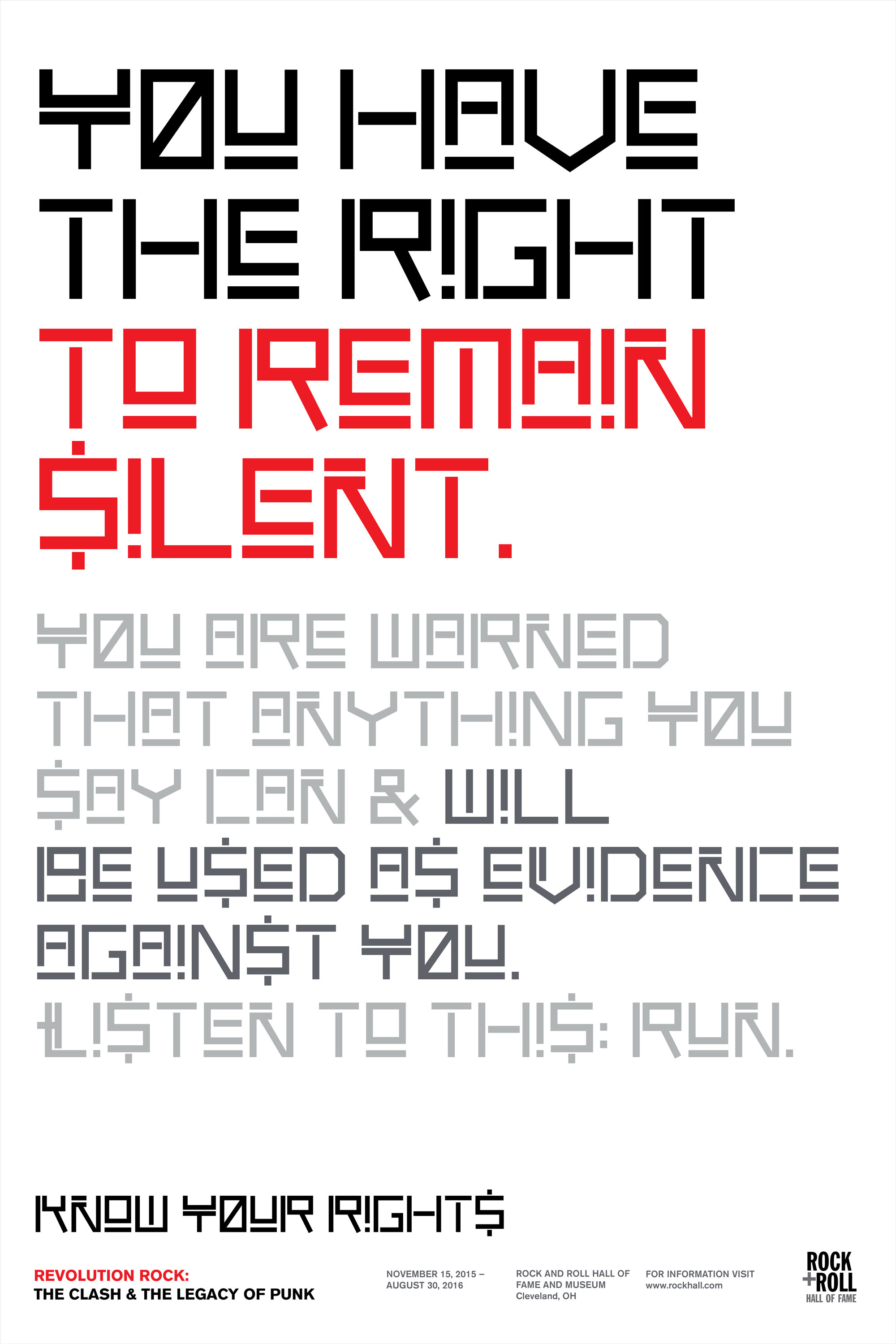
The primary typeface design was inspired by the military imagery the band often re-appropriated in their stage attire and the clean, immediate sound of their music. A secondary typeface based on Morse Code was designed as well, replacing the dots and dashes with x’s and +’s. The graphic look of song lyrics printed in this code felt true to the Clash’s music and the choice of x’s and +’s was taken from the Union Jack flag. The code element was also meant to reflect the message hidden in the Clash’s lyrics that was obscured by the pounding drums and bass, thrashing guitar, and Joe Strummer’s signature howl. While the music alone communicated emotionally to the Clash’s audience, the lyrics provided a second meaning to be discovered.
Strummer’s brutal honesty and criticism of the political and social issues in Britain in the late 1970’s could be transmitted straight to the listener without censorship while obscured by the band’s aggressive noise. Many of the Clash’s songs carry messages are still relevant and powerful. The poster series takes the lyrics from the song “Know Your Rights” and amplifies the harsh message that unfortunately still rings true over 30 years later.
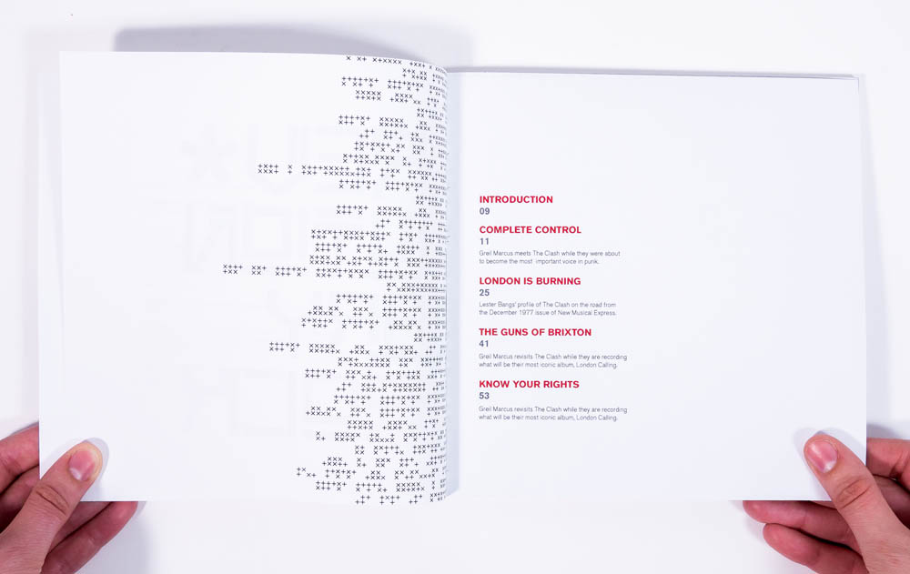
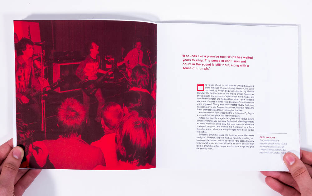
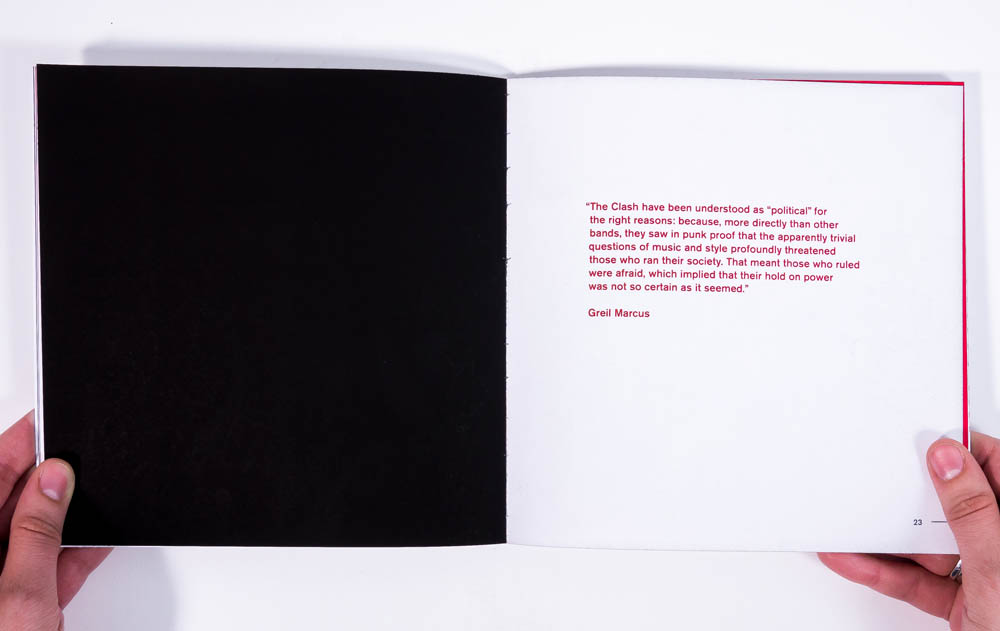
The exhibition book was an opportunity to unite and play with the visual language I had designed. I used essays written by Greil Marcus and Lester Bangs for the content of the book.
